





Decision 01
Split the landing page into a meaningful dashboard and a workspace.
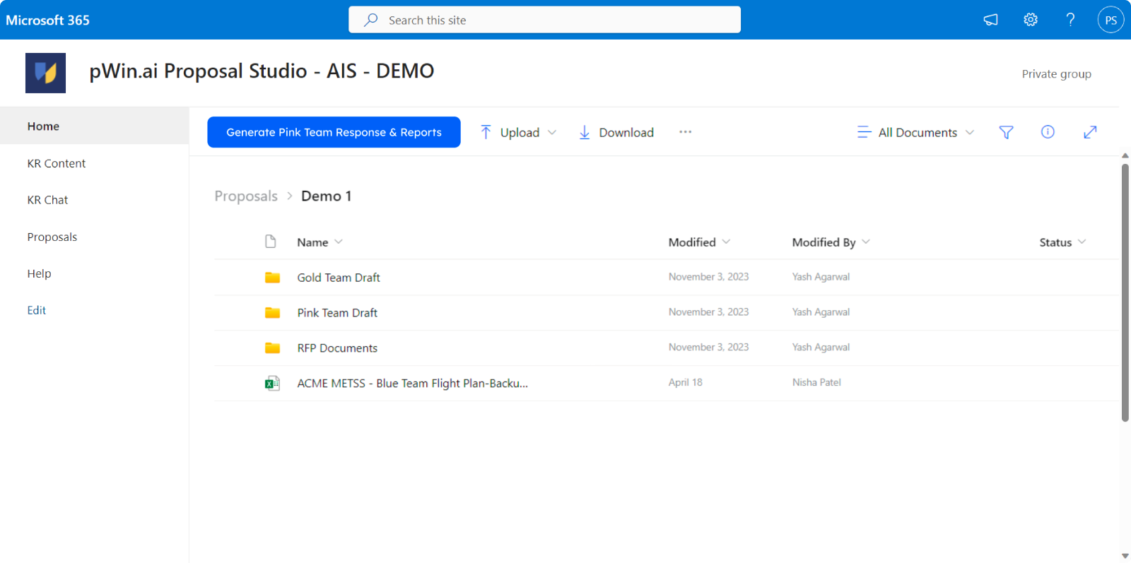
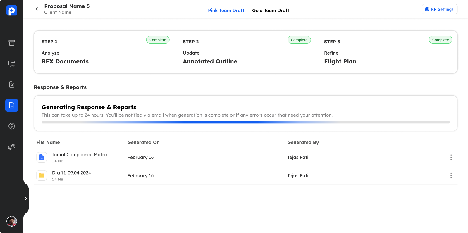
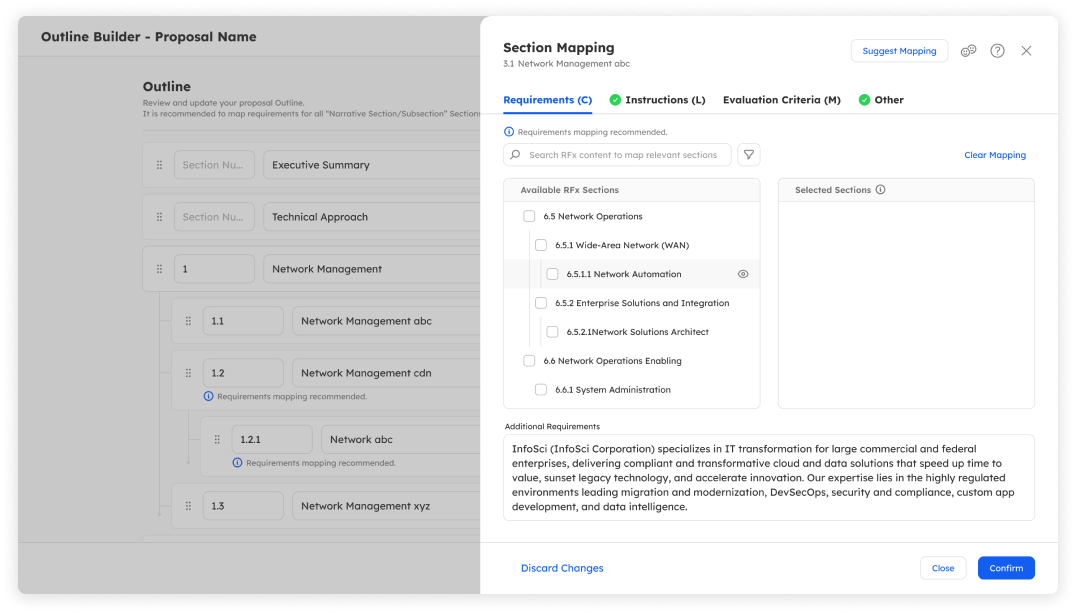
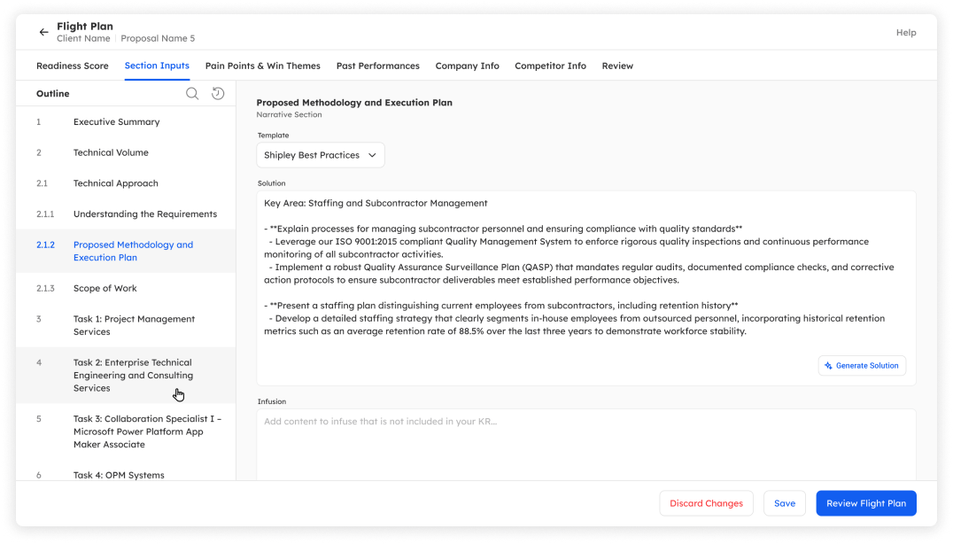
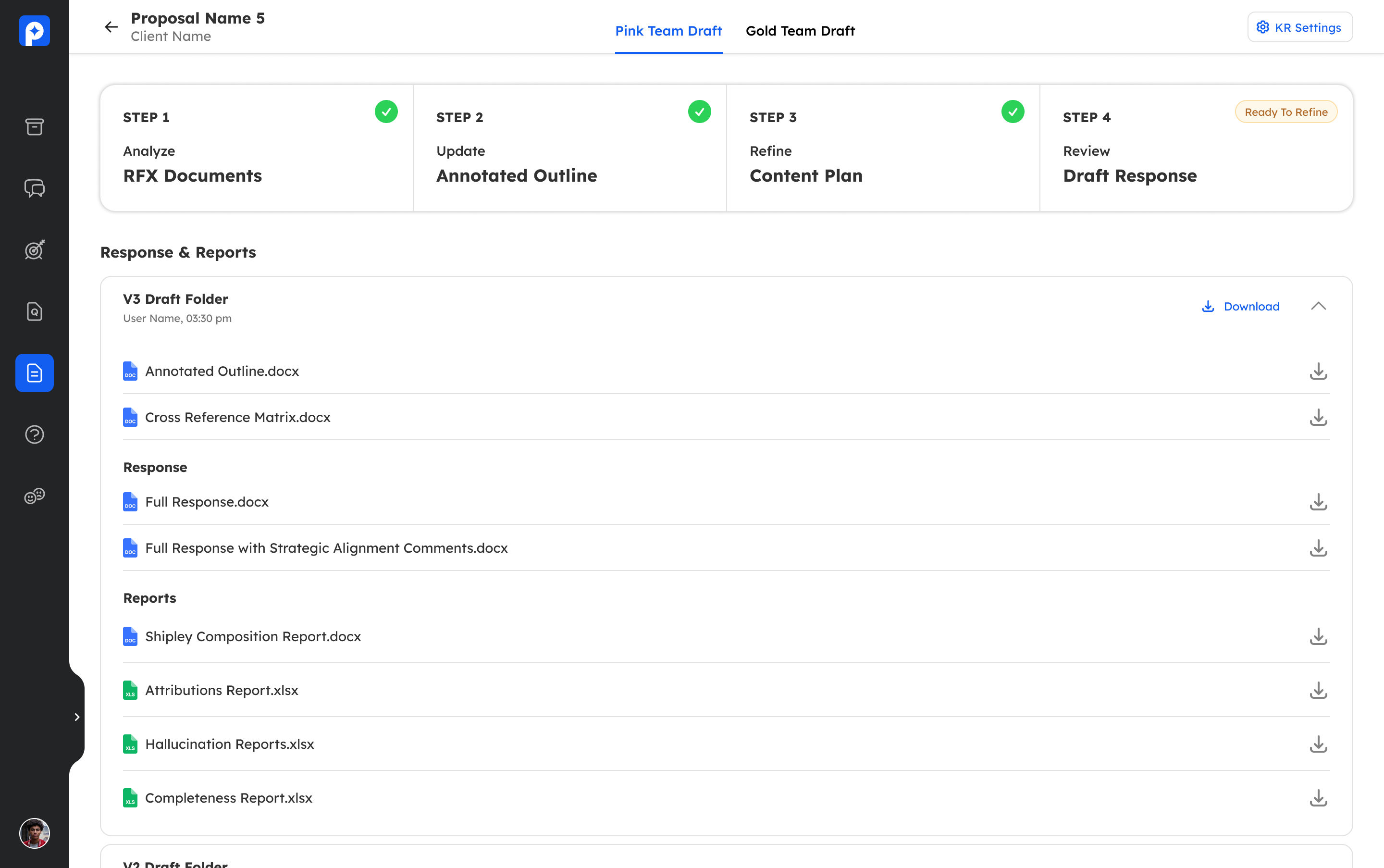
The proposal project opened on a landing page that was neither a dashboard nor a workspace: a stepper navigation sitting on top of a response package vault that stayed empty until the whole flow was finished. I split it into two tabs, a dashboard that answers "where does this proposal stand," and a workspace where the actual work happens.
What failed first
No insight or overview on the project apart from the workflow progress, wasting real estate on something that remained empty till the very end.
The move
A meaningful dashboard for full project overview, plus a dedicated workspace where all the magic happens.
The tradeoff
Two tabs add a navigation step, but each surface earns its own density instead of splitting the difference.
Loading live product
The original landing page behind, and the dashboard tab it became